Skip navigation

Tag Archives: text art

Andy Warhol and Roy Lichtenstein. Ever heard of them? That’s what I thought. Let’s get right into it:

Text in art till the mid-late 50’s had at best been an element in a larger composition, never quite the central aspect of the work. Duchamp fiddled about with the use of text for the occasional goof, but these goofs took some explaining. Ono, Ruscha, On Kawara and a host of others changed all that, using text as the literal medium/object of the work such that the idea of what art might become was forever changed. Not bad, eh?

But even with this revolution underway there remained an inherent mistrust of the use of images and language in tandem. Art had accepted single words (Ruscha), brief sentences (Ono) and the occasional amalgamation falling somewhere inbetween (Indiana), but what about work that pointed to something a bit more complex, yet harkening back to something far more sinister?

Before we dive into all that, let’s look again at those crazy images kids of the 40’s and 50’s had been hammered with:

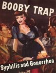
AtomicWar0101More-doctors-smoke-Camels-than-any-other-cigaretteGay novel 1960's   Booby trap

War, domesticity, cultural correctness and fear. Do this and you’ll survive. Do that and you’ll die. There’s no room for ambiguity in this equation, no nuance and certainly no %&#@ questioning of the Almighty Authority lest you be labeled a pervert, communist, intellectual, snob, square, Beat or Red. Happy Days was bullshit.

fonzie_henry_winkler_happy_days

So now instead of rebelling against those messages, Warhol appropriated the most banal example he could find (Campbell’s Soup Can) and Lichtenstein picked up the escapist imagery of comic books that kids of multiple generations turned to as an entertaining alternative to the pressures of growing up, aka: the constant bombardment of cultural propaganda (Whaam!). Freaking radical, sure, but a radical use of text in art? More so a necessary requirement, which is the real innovation here.

Here’s how it works:

Warhol’s use of text in the Campbell’s Soup Can is an essential identifying aspect of the art, but it isn’t the fundamental point of the art, though granted there’s no Campbell’s without Campbell’s. Warhol painted a mass-produced can of soup. The can requires text. Thus text is used to faithfully represent the can. Further, Warhol’s use of text doesn’t really signify the use of text in the same way Ono, Ruscha or Kawara used it. It’s akin to how Picasso or Schwitters used it, as a collage element (written by someone else) essential to the piece they were creating. The central aspect and end result, to my way of thinking, is that it’s a modern day still life, a winking reflection of the times. Or, better yet, a portrait. 

Warhol Campbell's Soup Can 1964

Lichtenstein’s use of text is essentially identical. That it has an aesthetically pleasing Pop form is a real bonus, making is more commercially accessible than, say, Lawrence Weiner. More importantly, both text and image are appropriated, turning the artist, via the use of low brow imagery, into a high brow critic of culture. The use of text + image has been sterilized, offering something harmlessly fluffy in return. That’s a smart bit of work, actually, allowing text to crawl back into bed with image without the child it bears telling you that you’re doomed. I imagine it had to be a massive relief, really, for all those former kids trudging home from their endless 9-5’s with briefcase and Fedoras, wives prepping TV dinners in their suburban homes with 2.5 kids begging for attention, seeing Drowning Girl in Leo Castelli and laughing hysterically all the way home.

Roy_Lichtenstein_Drowning_Girl

Which perhaps at some point leads to Christopher Wool’s Apocalypse Now (or Tom Waits’ Franks Wild Years), but we’ll get to that soon enough. In the meantime a preview!

Christopher Wool Apocalypse Now

Kurt Schwitters kicked your ass before you were born.

Untitled (D’Cily). 1942                         Man soll nicht asen mit Phrasen. 1930

Schwitters, influenced by Ferdinand de Saussurre (d. 1913) whose work focused on the relationship of sound to written language and tension between name and object (as illustrated by Magritte in 1928), worked in a multitude of genres including typography (see Merz, below), collage and painting. He also worked with performance pieces and poems that took the form of graphic scores. I don’t mean to imply I understand the entirely of his work, I’m stealing part of this while I better learn the larger picture of what he created. However, I do know this: Kurt Schwitters was the first to give equal weight to both artist material and text then exploring what this implied.

The Cubists were the first to use text in their work, but it was text as decoration briefly used. Schwitters saw it as a material to shape, nurture and blossom. Schwitters spanned the gap between the end of Surrealism and the explosion of a multitude of American art movements that took root in the 1960’s. He influenced sound exploration, poetry, music and design (all 4 wrapped up into John Cage).

Plus he created Merzbau, a freakish construct attempted 3 times, the first of which was in his apartment in Hannover, began in 1923.

It was destroyed by an Allied air raid, so he tried again in Norway in 1937 then again in London in 1947, a year before his death. Schwitters said Merzbau contained everything of importance to him, with the initial Merzbau containing grottoes for Hans Arp, Theo van Doesburg, caves for Hannah Hoch, El Lissitzky and Mies Van der Rohe, plus grottoes dedicated to abstract concepts such as a ‘murderers cave’ or ‘love grotto.’ It doesn’t get any better than that!

Everything changed in the 20th century. Cubists Picasso, Braque and Gris first incorporated text into painting and collage, both gigantic leaps forward in how materials were used in art – but more importantly the jarring juxtaposition of text mixed with traditional painting. Text didn’t yet have a message, it was simply incorporated as part of a material that contained newsprint – so modern as to be up-to-the-day contemporary, a feat without precedent. It might have terrified the classicists, born in the mid-1800’s, art that simply couldn’t be placed.

Pablo Picasso. Guitar. 1913                      Juan Gris. The Sunblind. 1914

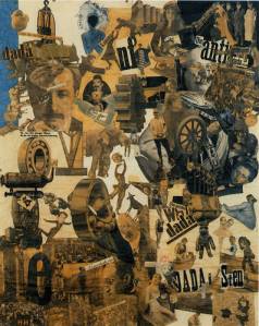
Dada incorporated text into their work as a rule of thumb. Brash and dexterous, Dadaist manifestos are hilariously brilliant reminders of a time when art was taken seriously and had a cultural relevance, which of course the Dadist’s tried to smash. Anti-war, anti-art culture and anti-bourgeois, the Dadists were also the first movement to incorporate their name into their work, something these days that’s akin to our own DNA.

Hannah Höch. Cut with the Kitchen Knife through the Last Weimar Beer-Belly Cultural Epoch in Germany. 1919

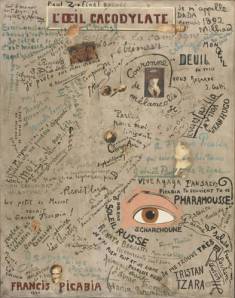
Francis Picabia runs through both Cubism and Dada straight into Surrealism. But before that, in same year he denounced Dada, Picabia crafted The Cacodylic Eye (1921), perhaps the most consistently modern text-art ever created. The canvas (58 x 46″) is nothing more than an eye, a few collaged photographs and the signatures of writers, artists and musicians who visited Picabia’s studio or went to his parties. Meant as a parody, it incorporates Dada’s profound sense of self-identity…

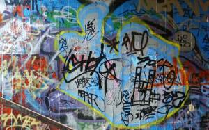
… and also it’s complete sense of the absurd. Better yet, in terms of text art, it IS text art, the first major piece I know of where image (or general lack of) is in service of the text and not, as is still generally the rule, the other way around. It’s also the first work to acknowledge the signature of the artist (in any genre) as being unique it its own right. The contemporary equivalent is graffiti, both the traditional tag and the modern, well, Banksy.

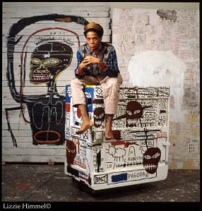
Better yet: Basquiat.

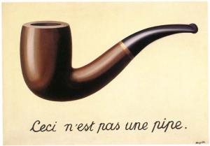
Lastly, for this era, there’s Magritte:

Magritte. This is Not a Pipe. 1928

Well it’s not text-art either, but it’s pretty damn smart, probably the most famous text piece of the period. Too bad Duchamp made the whole damn painting thing irrelevant 11 years earlier when he exhibited Fountain (signed by R. Mutt) in 1917. Still, it sells a lot of postcards.

After the 4th c text experiments by Simmias of Rhodes and before the form took root as actual art in the 20th century, not much happened by way of artistic development.

The most notable exceptions are of course Illuminated Manuscripts and the art of William Blake.

The manuscript is completely beautiful. The craft is outrageous and the presentation beyond reproach. However, per my 8 Rules of Text-based Art, this ain’t text-based art. However gorgeous, the text is in service of the art, or decoration. The text is the purpose of the piece, of the book, but it’s not text-based art in the way it will come to be understood in our lifetime.

William Blake, ok, let’s not kid ourselves, the man was savant-genius. I got to see his original work at a show at the Public Library in New York about 15 years ago. It was like being in the presence of the immortal.

However, per the Illuminated Manuscript above, it’s not text-based art. It’s art that features narrative in the service of both image and God. Beautiful, chilling, but it’s primary function (in the history of text-based art) is to illuminate the idea of a handwritten artform as Blake’s text is less gothic, less biblical and more so the writing of a man simply trying to write clearly in his art. Revolutionary? It probably was.

Of which, Blake’s modern equivalent is probably the Reverend Howard Finster who also told stories of Heaven and Hell, mixing both text and art.

Howard Finster Heaven and Hell

Howard spread the Word of God in many forms: as preacher, crafter of clocks, oil on canvas, screenprints, covering cars, bottles, anything that would take paint. He also invented Paradise Garden which the state of Georgia has finally given $ to restore and maintain. If you’re ever in Summerville it’s worth checking out. I saw it before the money arrived and it nearly broke my heart.